Fred Durst UNC Hat
Get the right fit from the start: take a quick look at our size guide before you order.
Nov 09
Nov 13 - Nov 17
Nov 23 - Dec 03
Related products
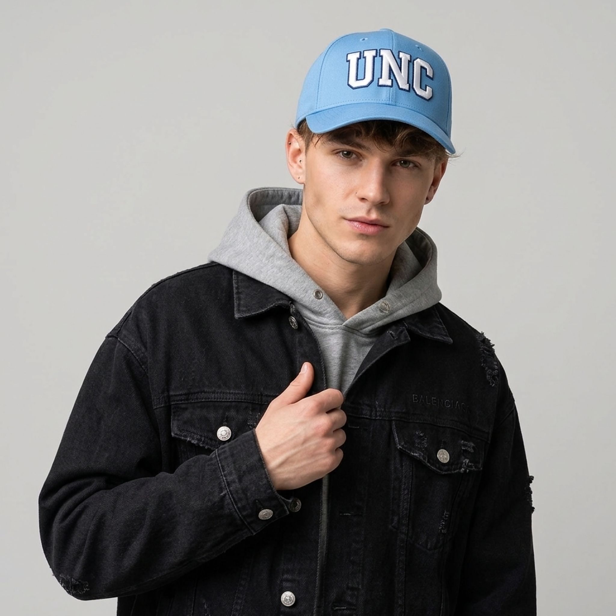
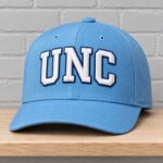
The Fred Durst UNC Hat is a baseball-style hat named for the Limp Bizkit frontman and built around a reference to the University of North Carolina at Chapel Hill. The university reference gives the hat its visual identity, with the familiar campus initials treated as the entire front graphic. That pairing brings a name from music and a reference from college sports into the same product, with the North Carolina connection expressed entirely through the design.
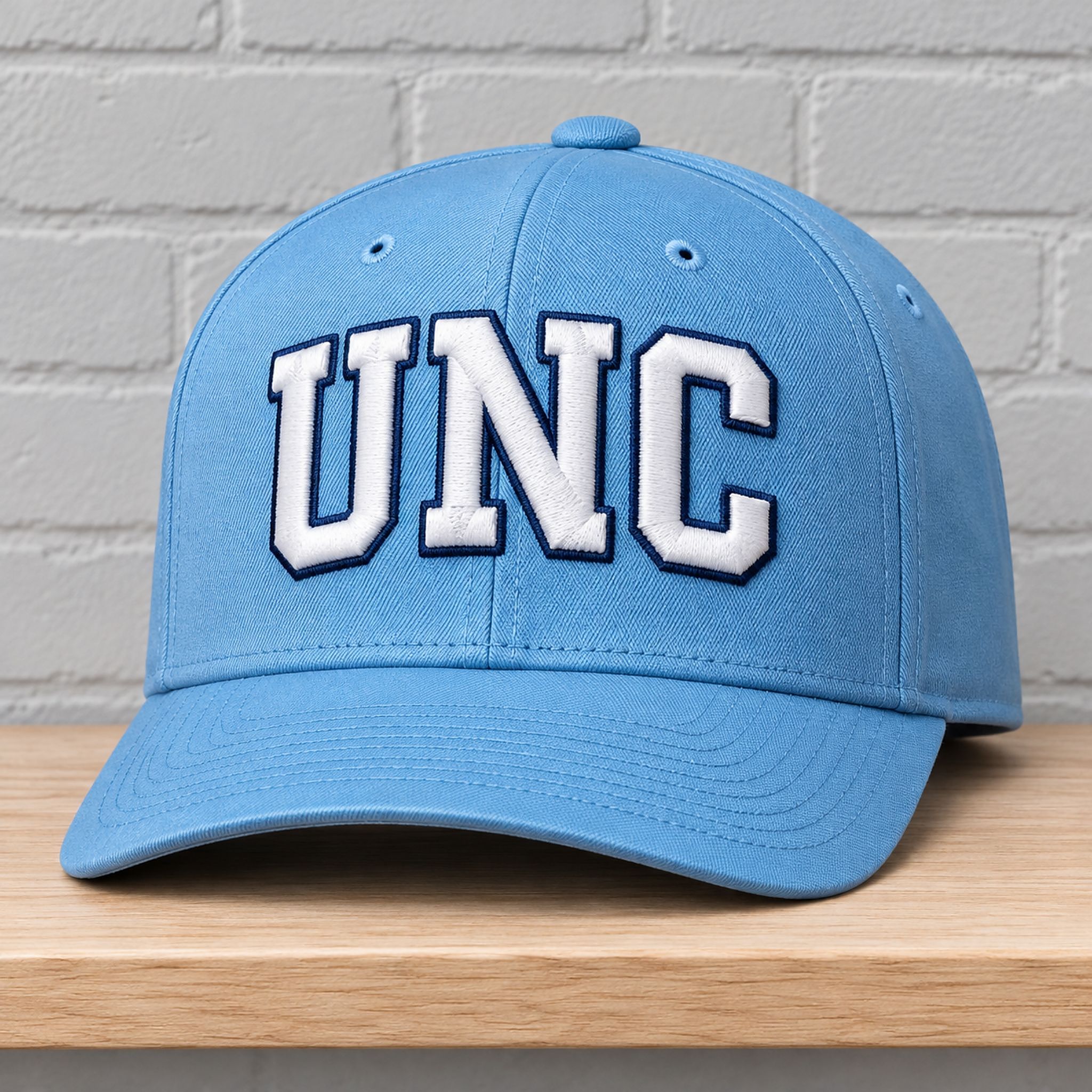
Fred Durst UNC Hat – Three Letters in Carolina Blue
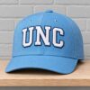
This 2026 Fred Durst UNC Hat features large white “UNC” lettering outlined in dark navy across the front of the crown. The three uppercase letters sit side by side in a shallow arch, with the “N” centered over the front seam and the “U” and “C” following the curve of the crown on either side. Broad strokes and clipped corners give the letters a varsity look, while the dark outline follows the shape of each letter, including the inside of the “U” and the open ends of the “C.”
The lettering sits low enough on the crown to feel anchored just above the brim, leaving a band of open blue above the graphic. Matching blue seams divide the rounded crown into panels that meet at a small blue top button, and small stitched eyelets sit above the lettering and along the visible side. The curved brim carries the same blue from the crown down to the front edge, with parallel rows of stitching following its curve. The brim stays free of lettering, so the eye goes straight to the white initials.
Fred Durst “UNC” Hat refers to the University of North Carolina at Chapel Hill, and Carolina Blue is the university’s primary color. On this hat, the initials and the blue crown do different jobs. The letters identify the school, while the color reinforces that association across the whole visible design. White gives the initials a bright center, and the navy border makes their angular shapes easy to distinguish where they cross the curved front panels.
The lettering also draws on the visual language of college athletics. Spelling out the initials as three separate block letters gives each one room to read, particularly the “C,” whose open shape finishes the arch on the right. It’s a compact way to put the North Carolina reference front and center, with the three letters doing all the work of a longer wordmark.
Product Details
Design — White “UNC” lettering with dark navy outlines
Color — Carolina blue crown and brim
Brim — Curved with parallel rows of blue stitching
SHIPPING POLICY
WHAT ARE THE SHIPPING COSTS?
Domestic shipping within the United States is set at $5.95 USD. International shipping begins at $13 USDWHERE DO WE SHIP?
We proudly ship worldwide, extending our services to customers across the globe.Shipping time
US Regions:
| Item | Handling time (Mon-Fri) | Shipping time ( Mon-Fri ) |
| Apparel | 1-3 days | 3 -7 days |
| Mug | 2-3 days | 3-7 days |
| Poster, Canvas | 1-3 days | 3 -7 days |
| Hats | 2-3 days | 6-8 days |
| Bedding | 3-5 days | 7-10 days |
| 3D Clothing, Hawaiian shirt… | 3-5 days | 8-12 days |
Other Countries:
Handling time (Mon-Fri): 3-5 days
Shipping time ( Mon-Fri ): 15-25 days.
Note: Delivery times may vary due to holidays, destination, or courier delays.Delivered
Total delivery time = Handling time + Shipping time While we provide estimated delivery timelines, please be aware that unforeseen delays beyond our control may occur. These may include factors such as courier logistics, customs inspections, weather conditions, national holidays, or incomplete delivery details. We recommend allowing additional time when planning deliveries close to specific deadlines. We continuously strives to ensure prompt and secure delivery, yet cannot be held liable for delays caused by third-party or external circumstances. If you experience any issues with your order or need assistance with modifications, please contact us at [email protected]. Our support team is always ready to help and ensure your satisfaction. Regarding shipments with multiple addresses, we regret to inform you that our system currently does not support this feature. Should you wish to send items to separate destinations, please place individual orders for each address. Shipping is available for PO Boxes; however, we do not support delivery to Military APO/FPO addresses at this time. Concerning international orders, please note that all shipments from the United States are processed DDU (Delivered Duty Unpaid). We does not collect VAT or import duties during checkout. Any applicable customs fees, VAT, or import duties are the responsibility of the recipient upon the package’s arrival. We encourage customers to check with their local customs authorities for guidance on applicable duties or tax policies in your region.Quick FAQ
Every Zerelam garment is made-to-order using premium materials carefully selected per product. Most of our apparel is crafted from high-quality polyester, cotton, or polyester-cotton blends, chosen for softness, breathability, and long-term shape retention.
Designs are applied using Direct-to-Garment (DTG) or All-Over Print (AOP) sublimation with OEKO-TEX-certified, water-based inks. This gives sharp colors, a smooth feel, and a print that bonds directly with the fabric — no cracking, peeling, or vinyl-style overlay. The exact fabric and print method for each item is listed in the product description above.
Zerelam offers inclusive sizing on most apparel from XS up to 5XL, so every body can find the right fit. Our tees and hoodies follow a unisex, true-to-size cut with a relaxed shoulder line and a slightly longer back hem for natural movement.
For the best result:
- Check the size chart on the product page — measurements are listed in both inches and cm.
- If you’re between two sizes or prefer an oversized look, size up one.
- AOP (all-over print) styles tend to fit slightly more relaxed than DTG tees.
Still unsure? Email [email protected] with your height, weight and usual size — we’ll recommend the best fit.
To keep your Zerelam apparel looking new and the prints vibrant for years, follow these simple care steps:
- Machine wash cold (max 30°C / 86°F) on a gentle cycle.
- Turn the garment inside out before washing to protect the print.
- Use a mild, bleach-free detergent — skip fabric softeners and harsh chemicals.
- Tumble dry low or hang dry in the shade. Avoid high heat.
- If ironing, iron inside-out on low heat — never directly on the print.
- Do not dry-clean.
Following these guidelines protects the DTG/sublimation print and keeps the fabric soft, structured, and color-rich wash after wash.
Yes — durability is a core part of what we build at Zerelam. Every piece is printed with professional-grade Direct-to-Garment (DTG) or sublimation technology using OEKO-TEX-certified, water-based inks that bond directly with the fabric fibers instead of sitting on top like vinyl or transfers.
When you follow our care guide (cold wash, low-heat dry, inside-out ironing), customers consistently report that prints stay vibrant for 50+ washes with no cracking, peeling or flaking. Our heavyweight cotton blends and reinforced double-stitched seams help the garment itself hold its shape and color long-term.
If you ever receive an item with a printing defect, contact [email protected] within 7 days and we’ll send a free replacement.
Every Zerelam item is printed, finished and shipped from our partner production facilities in the United States, primarily based in Michigan and across our U.S. fulfillment network. Because we operate on a true print-on-demand model, nothing is mass-produced overseas — your item is custom-made after you check out.
Standard production takes 3–5 business days before your order leaves our facility. From there:
- USA: typically 5–8 business days door-to-door.
- International: typically 10–25 business days, depending on destination and customs.
Each package is shipped with a tracking number emailed to you the moment it leaves the warehouse.
 Fred Durst UNC Hat
Sorry, no reviews match your current selections